
The colors you choose when creating a website design are more important than you may realize. Your website colors will frame your content and affect user experience. Choose them carefully and use them well.
This article will discuss basic color theory, how web users experience color, and how to apply this knowledge to your website.
Color Theory Weighs In
Color theory is basically the study of how colors relate in design – their contrast, vibrancy and how they complement each other.
Consult the Color Wheel. There are formulas – color families – that are considered ‘go-to’ color combinations. They are at least worth consideration as a starting point.
Three classic color families that work well together:
Analogous colors are next to each other on the color wheel.
Complimentary colors are across from each other on the color wheel.
Triadic colors are three evenly spaced colors on the color wheel. (Visualize a triangle inside the wheel. The three points represent Triadic colors.)
Article: Learn the Basics of Color Theory to Know What Looks Good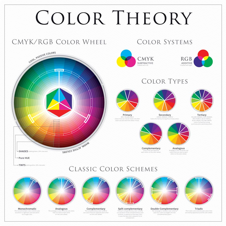
The Psychology of Color
Certain emotions and ideas are associated with colors. Awareness of this can be useful when creating web design. The Psychology of Color is a complex science and this is only a brief summary. Also, variations of the color can affect its ‘feel’.
Warm Colors
Red – intensity, love, excitement
Orange – warmth, energy, joy
Yellow – happy, sunny, intensity
Cool Colors
Green – growth, wealth, health
Blue – calmness, strength, security
Purple – sophistication, luxury, romance
Article: Color Psychology: The Emotional Effects of Colors
Using Color on Your Website
Evaluate the logo first. Complement the style and color of the logo in your website’s color pallet and design. If the logo is a hindrance to the design you may be able to create a b&w, simplified or re-recolored version of the logo. If all else fails, use a text-only version.
Bottom line – don’t clash with the logo.
Limit the colors. Typically, a color pallet for a website should consist of 2-3 core colors.
Interactive color scheme creator tools:
• Color Scheme Designer
• Adobe Color CC
• Color Palette Generator (upload an image & it creates color palette from it)
• ColorHexa (color families, tones, shades, etc.)
Some colors should be avoided in web design. Very bright or fluorescent colors can be visually abrasive and considered tacky.
Article: 10 Troublesome Colors to Avoid in Your Advertising
Think long and hard before making a website too dark or cluttered. Open, clean space that directs the eye is restful and feels safe. White space is your friend – and it is not always white.
Avoid color combinations that do not provide enough contrast to read text easily.
A light background with dark text is most legible. Poor contrast can cause eye strain, negative user experience, and lower SEO.
Article: Color Contrast for Better Readability
Be mindful of the color blind. Color blindness is more common than many people realize. Boost the user experience of the color blind by remembering:
• The following color combinations are difficult for the color blind: green/red; green/brown; blue/purple; green/blue; light green/yellow; blue/grey; green/grey; green/black
• Use good contrast
One more thing… It’s not that simple.
Choosing and applying color to your website is not the same for every website. Most rules of design are not hard and fast, they are just ‘best practice’ guidelines. There are exceptions – and sometimes the exceptions work very well.
In Conclusion
Choosing the best colors for a website can be challenging. Consider the use of color families, The Psychology of Color, and other web design color ‘best practices’ to boost your design and user experience. Make color work for you!
___________________________
Terms
Hue – a color or shade
Saturation – intensity of a color
Shade – adding black to a hue
Tint – adding white to a hue
Tone – adding grey to a hue
Contrast – how clearly one element is distinguishable from another
White Space – areas on the page without content
Related: Learn WordPress – Advice & Tips for Beginners
Related: Learn WordPress – 18 Blog Essentials
Related: Learn WordPress — Maintaining Your WordPress Website
Image Credits:
featured image: Ms_lucky / bigstockphoto.com
color theory image: marin_bulat / istockphoto.com

Mon Sheri Design
Grand Rapids, Michigan
Sheri Lossing
designer|photographer
— I am a freelance web and graphic designer who also does professional photography.
— I drink a lot of coffee, live in front of my computer, and occasionally leave my house. I love what I do.
You might also like…

Preparing for Your Portrait Session
As a photographer, I want my clients to feel prepared and comfortable during their portrait session. Being prepared for your photo session pays off. Get familiar with poses. What should you wear for your photo session? Dos & don’ts for portraits. Seniors, headshots, children’s portraits, couples, family portraits…

My Resolution to Not Let My Chair Kill Me
I don’t do ‘New Year’s Resolutions’. But this year I am determined to make some needed progress toward a healthier me. The problem? My chair is trying to kill me. I am not an athletic person. I work long hours at my computer – sometimes 12-plus hours a day. My resolution? To be healthier. Why I refuse to diet…

Your Business Website Is More Than Just A Pretty Face
What I Have Learned About Web Design: Website design is a complex dance. Website visitors are a tough crowd. You must appease the 800-pound gorilla named Google. Sometimes you have to kill your darlings. Details are killer….